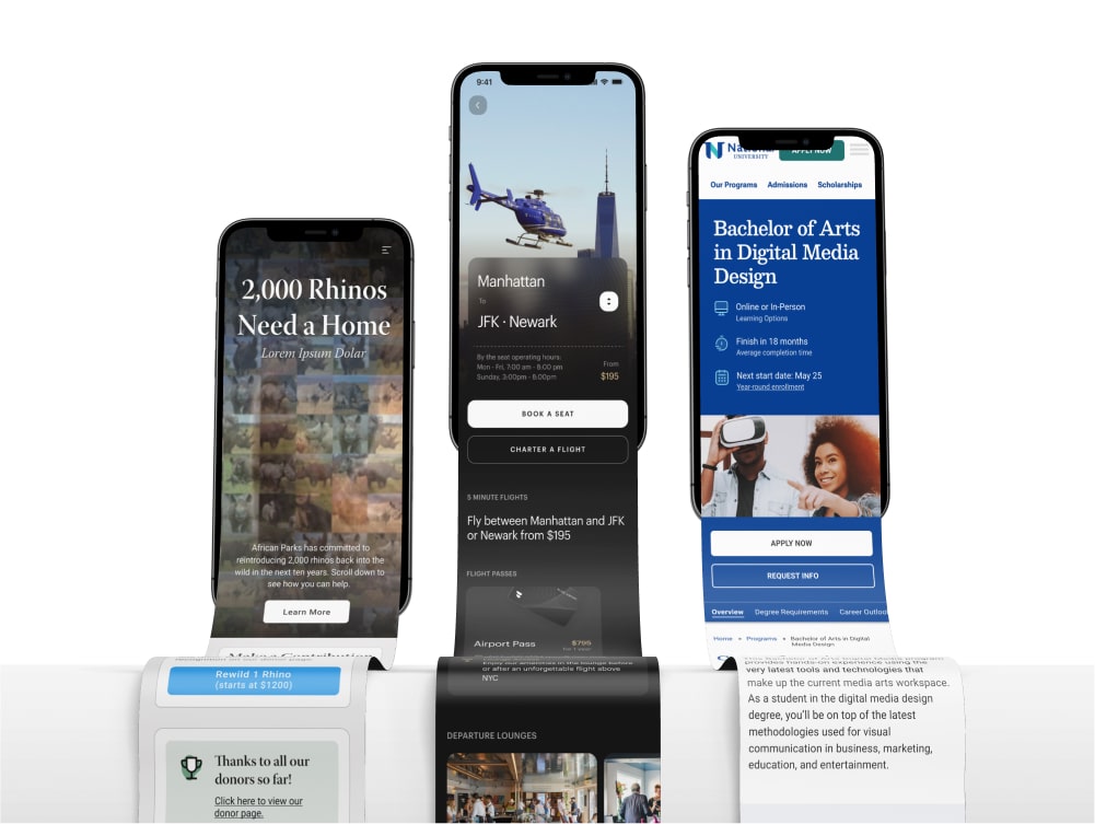
Redesigning a 3D Scene-Builder Software Interface
I redesigned the UI and information architecture of the web application Event Render.
Role:
Lead Product Designer
Company:
Event Render
Project Type:
Live Web Application
Timeframe:
Oct 2021 - Feb 2022
Team:
Eric Westendorf - Founder
Jeffrey Campbell - Developer
Project Overview
Summary
A tool to create 3D renderings of live events.
Event Render is a 3D scene builder web application built in Unreal Engine. Event companies use this application to create renderings of the setup of future live events such as conferences or performances. In the past this task would typically be outsourced to an expert, often with a high price tag, who would create professional renderings. Event Render allows a client's in-house team to create renderings quickly and easily. When I joined the project, Event Render was already live with an active subscriber base.
The Problem
A high learning curve
Research and user interviews indicate that Event Render's unique service is valuable to users. However, the development process up to this point had focused on adding features, and usability had taken a back seat. As a result, the software had a high learning curve and required in-person tutorials and in-depth video walkthroughs to understand how to use it.
Hypothesis
A more intuitive app = increased engagement.
Creating a more intuitive, learnable, and aesthetically pleasing user interface would significantly improve the experience for both current and new users. Our success metrics for this included the following:
Usability Analysis
I began by assessing the current state of the user interface of Event Render. It was clear from the outset that employing usability principles and Gestalt laws of grouping could significantly improve how intuitive the app was.
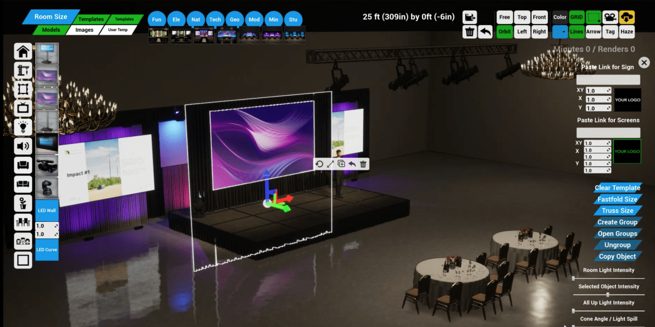

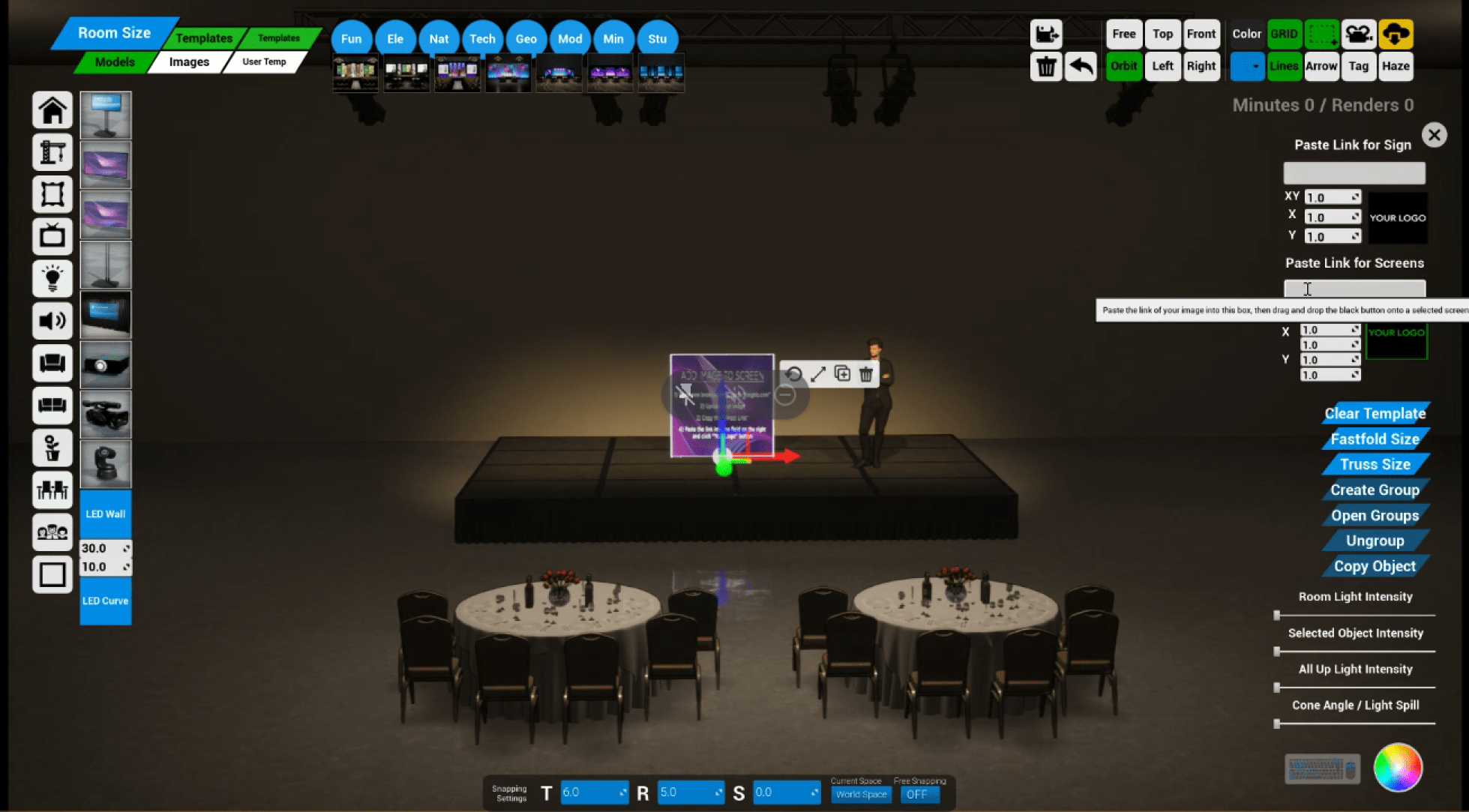
The existing UI of Event Render (above) suffered from a number of usability issues, lack of consistency, and visual clutter.
The tools menu (upper-right) was a key area for improvement, as it showed all tools next to each-other without separation by group or function. Furthermore, buttons used "system" or "insider" language, which made their operations challenging to decipher. Lastly, the inconsistent use of icons, font size, and color increased cognitive load and visual clutter.
Context-Sensitive Controls
I saw another clear opportunity for improvement with what I came to call "selection controls" (right screen edge). These functions would appear once a user had selected an object in their scene, allowing them to toggle between sizes, group items, change the color, etc. But as it stood all controls would appear when ANY object was selected, regardless of whether they applied to the current selection. Making the selection controls sensitive to context would be a massive usability improvement since users could immediately see and understand the relevant tools available to their current selection.
Accessibility
Lastly, some images and text were too small to be able to see or read clearly. Ensuring these were an accessible size would be an essential consideration during the redesign. This presented a challenge because the app was rendered at a fixed resolution on the server and then streamed to the user's computer. I decided to ensure components were easily viewable at 15" screen size and up, based on data from current users.
A usability analysis (above) was created as a first step in this process.
Information Architecture / Navigation
I began to rethink all the menus to incorporate more navigation structure and grouping principles. I conducted a card-sorting exercise to evaluate how to group different tools. I used this as a starting point for conversations with the team, where we began redefining the platform's navigation structure. We arrived at 5 distinct navigation groups.
The utilities menu:
Render
Save
Undo
Shortcuts
Help
The tools menu encompasses all preferences and tools not tied to a current selection:
View Controls
Selection Preferences
Measure / Markup
Visual Preferences
The selection controls menu presents all functions relevant to the current selection:
Screen size / truss size
Group / Ungroup items
Set dimensions L x W x H
Image settings Move / Stretch / Scale
Movement snap settings
The lighting controls menu presents all controls and functions for adjusting stage lights and screens:
Light brightness / Screen brightness
Color
Cone Angle
Venue Lights / Uplights / Selected Light
Finally, the build menu encompassed the tools that allow users to add objects to their scene, and manipulate the space:
Add Object
Add Image
Templates
Build Tool (room size, quick-start)
We sorted the tools menu into a tab navigation format, which made the scope of available options much more apparent, as well as where to find them. Similarly, for selection controls, we decided which tools should be available for each kind of item that a user selects. For instance, if a user selects a truss, the "size" button appears to cycle through preset lengths. If multiple items are selected, the "group items" button appears, and so on.
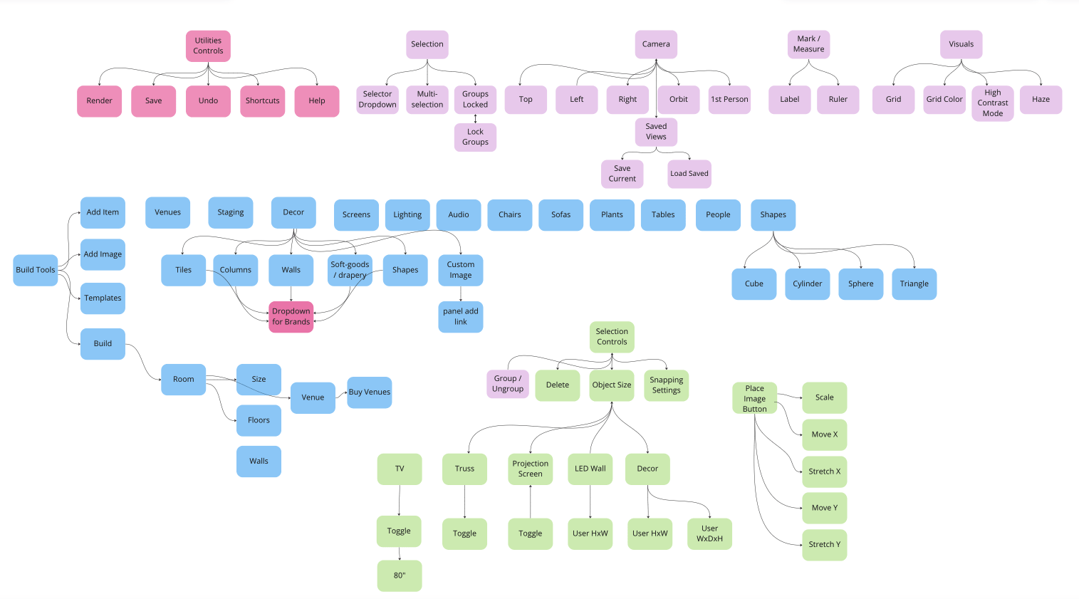
The findings from the card sorting exercise were sythesized into a user flow diagram, which guided the rest of the design process.
Design Pattern Research
I looked at design patterns used in various other room-builder software to draw inspiration and ensure that the format would feel familiar to new users of Event Render. We took a page out of the UI design of several video games and decided to explore putting the addable objects at the bottom of the screen instead of on the left edge. Doing this would leave more horizontal space clear, which research has shown was more valuable than vertical space when using the software.
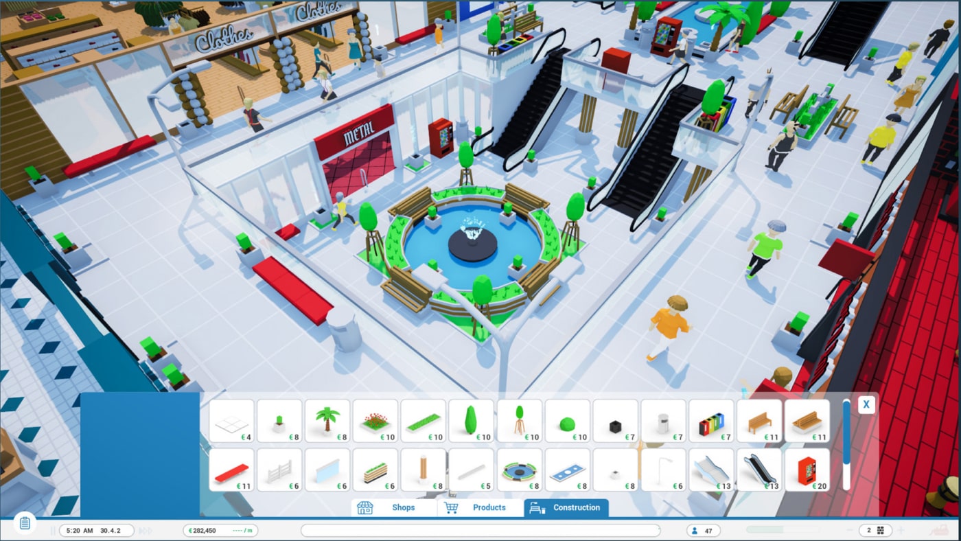
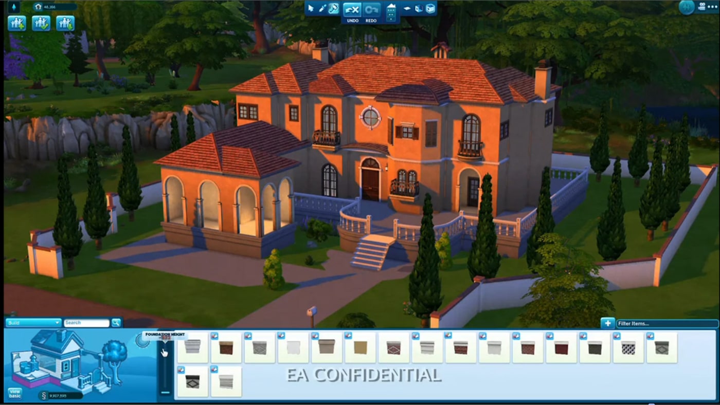
UI pattern examples from scene-building games were used in research the phase.
Rapid Prototyping
I then led a design sprint with the team, where we quickly mocked up various layouts for the new user interface. I completed this in medium-fidelity since it was essential to convey to stakeholders that the new designs would improve the current design format. We discussed what was working and not working and refined these options into a shortlist, which were then dot-voted.
Mid-fidelity rapid prototypes were made during a design sprint to quickly test and validate various layout options.
Interactive Prototype / User Testing
I created an interactive prototype in Figma to conduct tests with current app users. The testing exposed no major usability issues, but it was valuable for validating design choices. Users appreciated the new navigation structure, how controls appeared based on context, and the overall aesthetic.
Even in the limited scope of the test, users discovered tools they had yet to realize existed, even though the functionality was not new. This was excellent validation that the redesign would allow the software to be more learnable and intuitive.
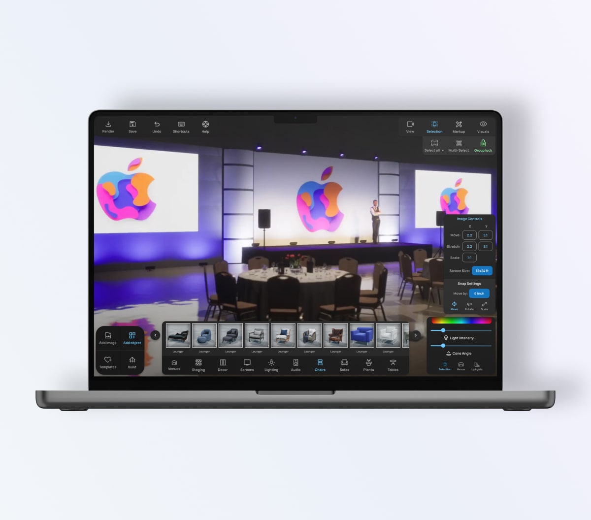
Final Designs
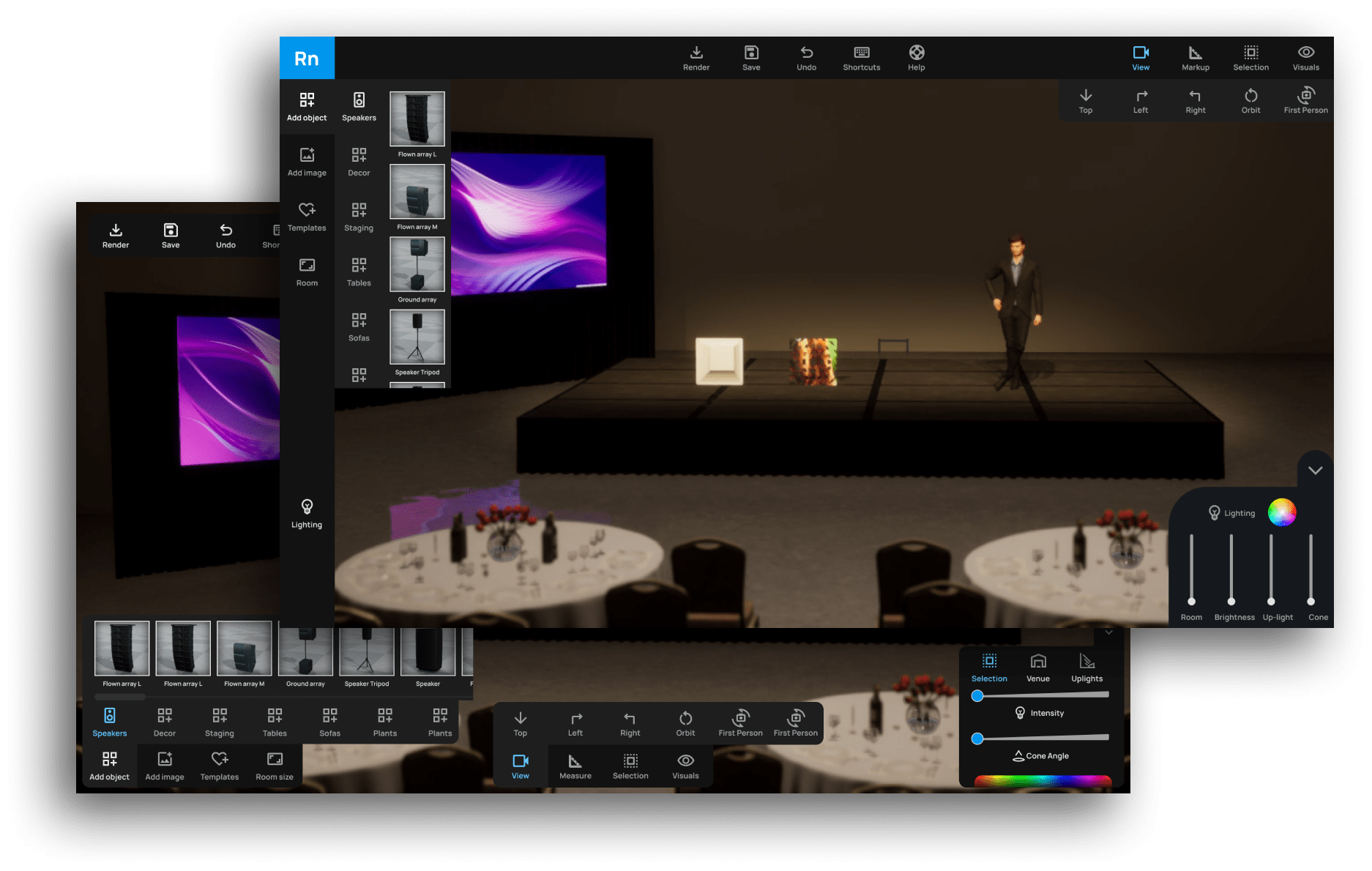
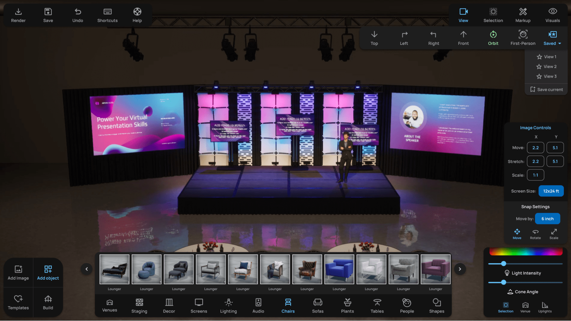
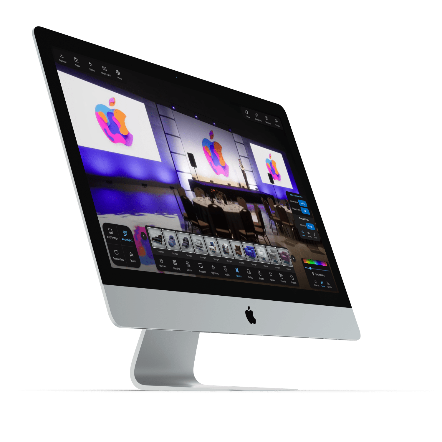
The final designs for a new iteration of Event Render incorporated findings from the usability analysis, card sorting, prototyping, and user testing. I grouped tools and menus onto separate panels to indicate their different functionalities. We decided to implement floating, minimal panels that would obscure the viewable area of the scene as little as possible. I also created the UI in dark mode to avoid drawing focus too much from the scene.
Before and After: Primary Menus

Object Controls: Before and After
I relocated the object controls pictured here to the bottom of the screen, which allowed for larger thumbnails without interfering with screen space.
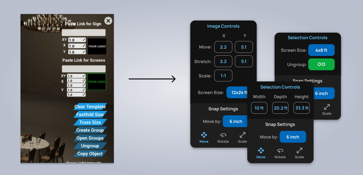
Selection Controls: Before and After
Selection controls become context sensitive, and only display relevant tools and controls within a dedicated panel.
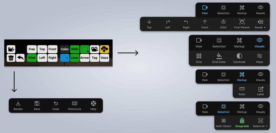
Tools Panel: Before and After
The tools panel was sorted into dropdown menus to make them more intuitive and understandable. While colors had been used loosely before, now blue indicates an active navigation level, while green indicates a toggle tool that is currently active.
Utilities were sorted into a separate panel to be located in the upper left of the screen.
Style Guidelines
I created a comprehensive style guidelines document for the development team. In addition to implementing icons, color, typography, and shadows, I detailed best practices for all menus and how and when to use different variants.

Project Takeaways
Highlights from this project included:
Redesigning Event Render allowed me to take a product already offering value to its users and significantly improve the user experience. I found this very rewarding, and I enjoyed the challenges of working on a complex application with deep and complicated features. The development team is implementing the new design, and I look forward to evaluating success metrics after it launches.
Working closely with the founder and development team throughout the process.
Evaluating the usability of a live application with a deep feature set.
Rethinking the navigation structure from the ground up.
Identifying and simplifying "insider" or "system" language and concepts.
Designing a new interface that is sleek, minimal, and easy to use.
Applying a consistent style set of icons, typography, and color.
Articulating a new design system for using color, with different levels of gray, green, and blue used only in certain instances.
Interested in working together?
Have a project I can help with? Have a question about something on my website? Reach out using the form below, or send me an email.